Overview
Terms
- Styles: Base design tokens, including color styles, text styles, and effect styles.
- Components: Graphics + reusable properties.
- Patterns: Repeated state (hooks) + attached Components (customizable).
Installation
To use the Bookipi Design System in your project, install the @bookipi/bds package.
After installing the Bookipi Design System, you need to set up the theme and import the system CSS file at the root of your application.
<!-- apps/frontend/src/index.ejs -->
<html data-theme="payroller">
  ...
</html>
// apps/frontend/src/app.js
import '@bookipi/bds/tailwind.css'Contributing
Currently, the BDS package is in the design-system branch of the payroller-web-partial repository.
It enables us to test BDS effortlessly with Payroller v1 and v2 products, which are the primary users of BDS at the moment.
.
├── packages
│   ├── bds
│   │   └── src
│   │       ├── Components
│   │       ├── patterns
│   │       └── ...
│   ├── pds (legacy, don't add more here)
│   └── ...
└── apps
    ├── docs
    ├── frontend
    └── ...
To develop BDS components with the Bookipi Web App, check out "Integrating BDS with Bookipi Web App" by JS Park
Workflows: Figma Basics
1. Dev Mode
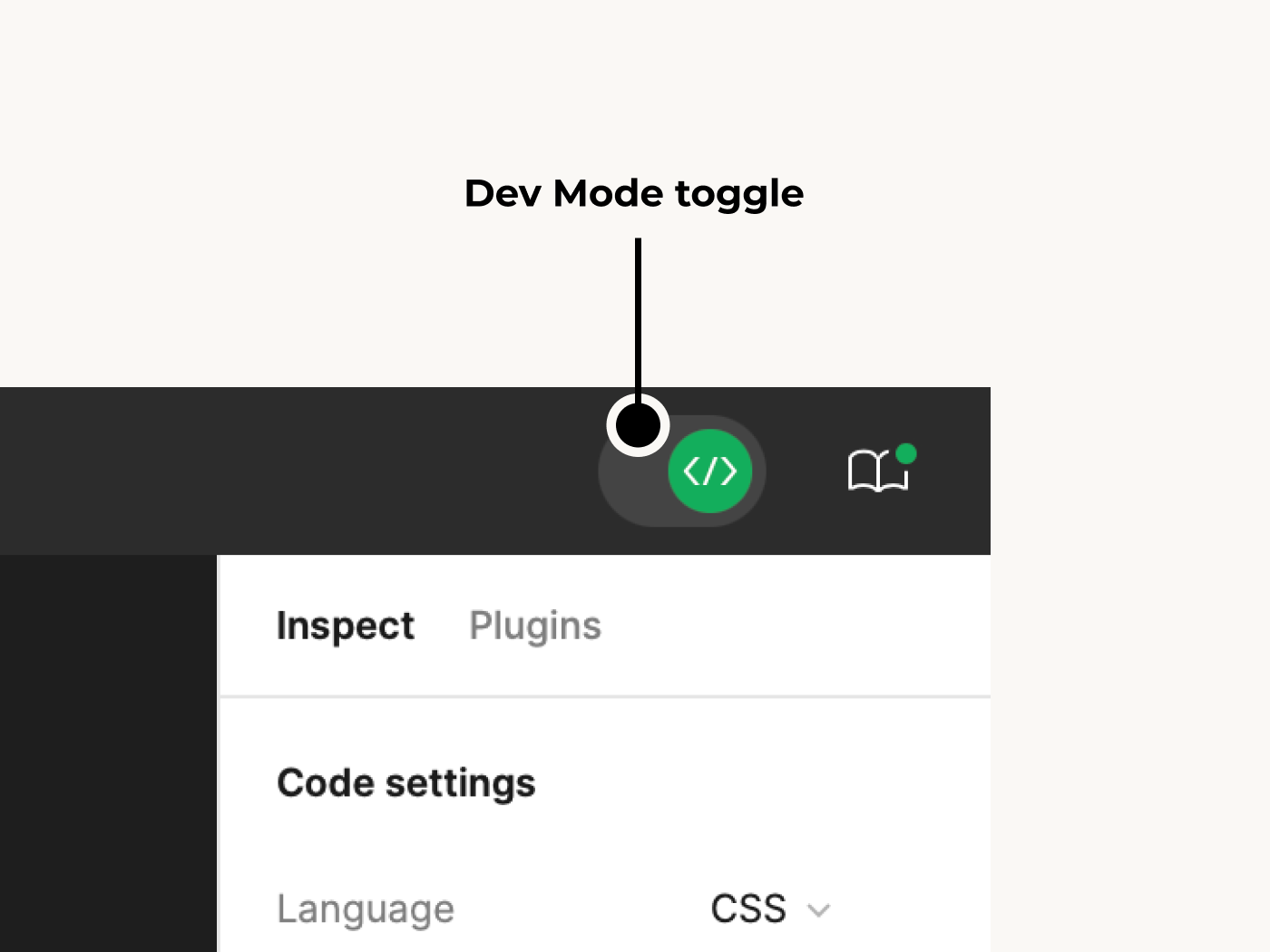
Toggle it on before starting development.
You can find out whether each layer is from BDS or not.
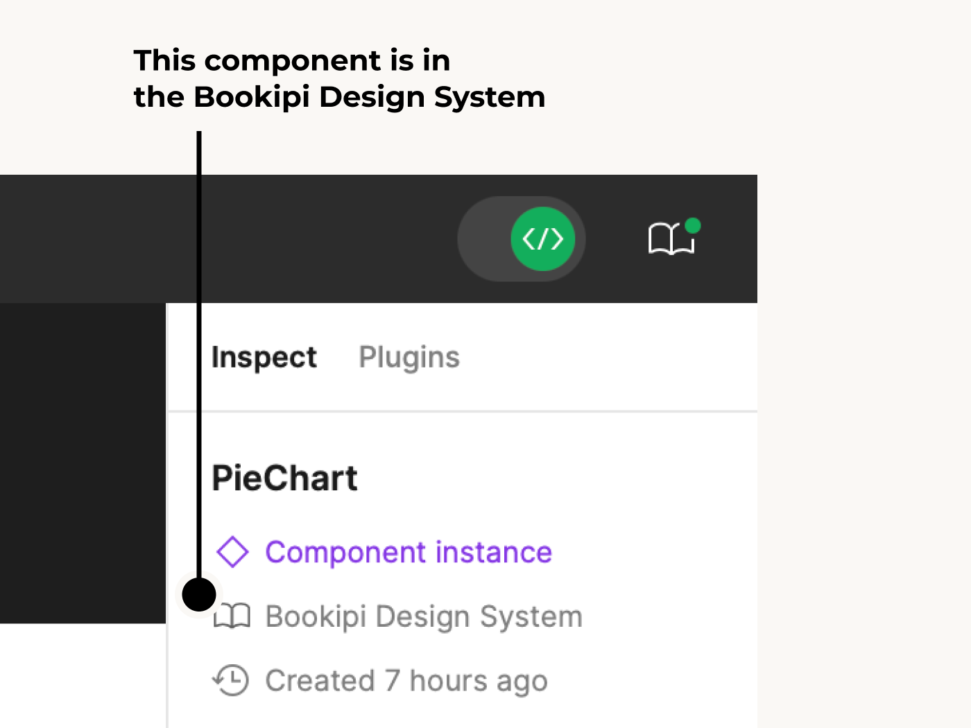
e.g) PieChart is a BDS component.
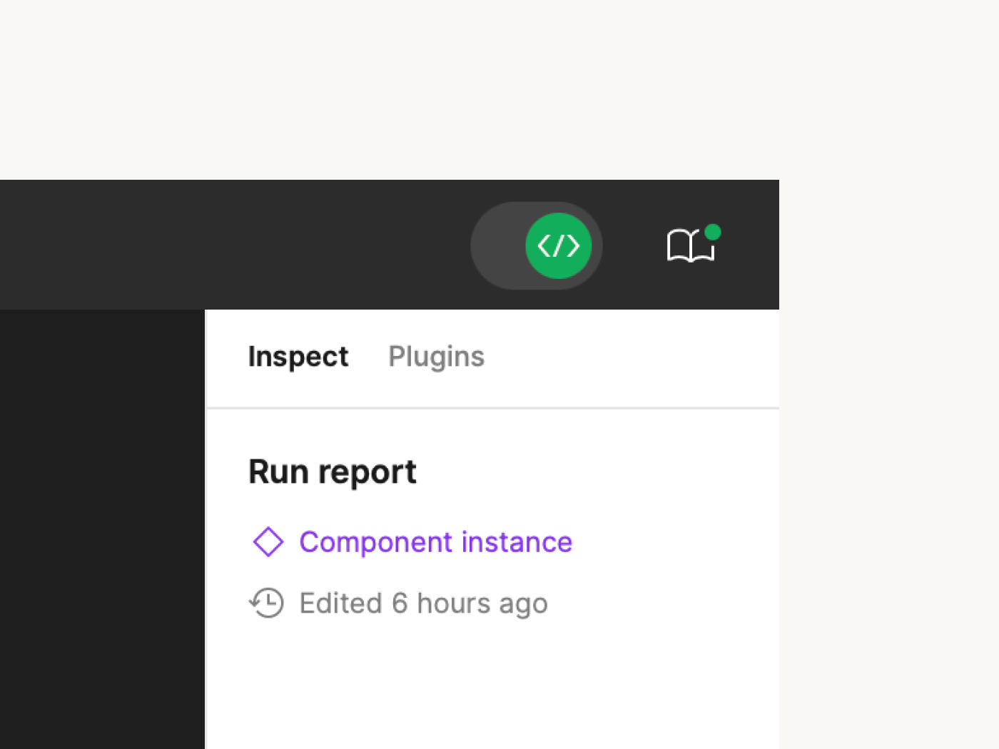
e.g) Run report is NOT a BDS component.
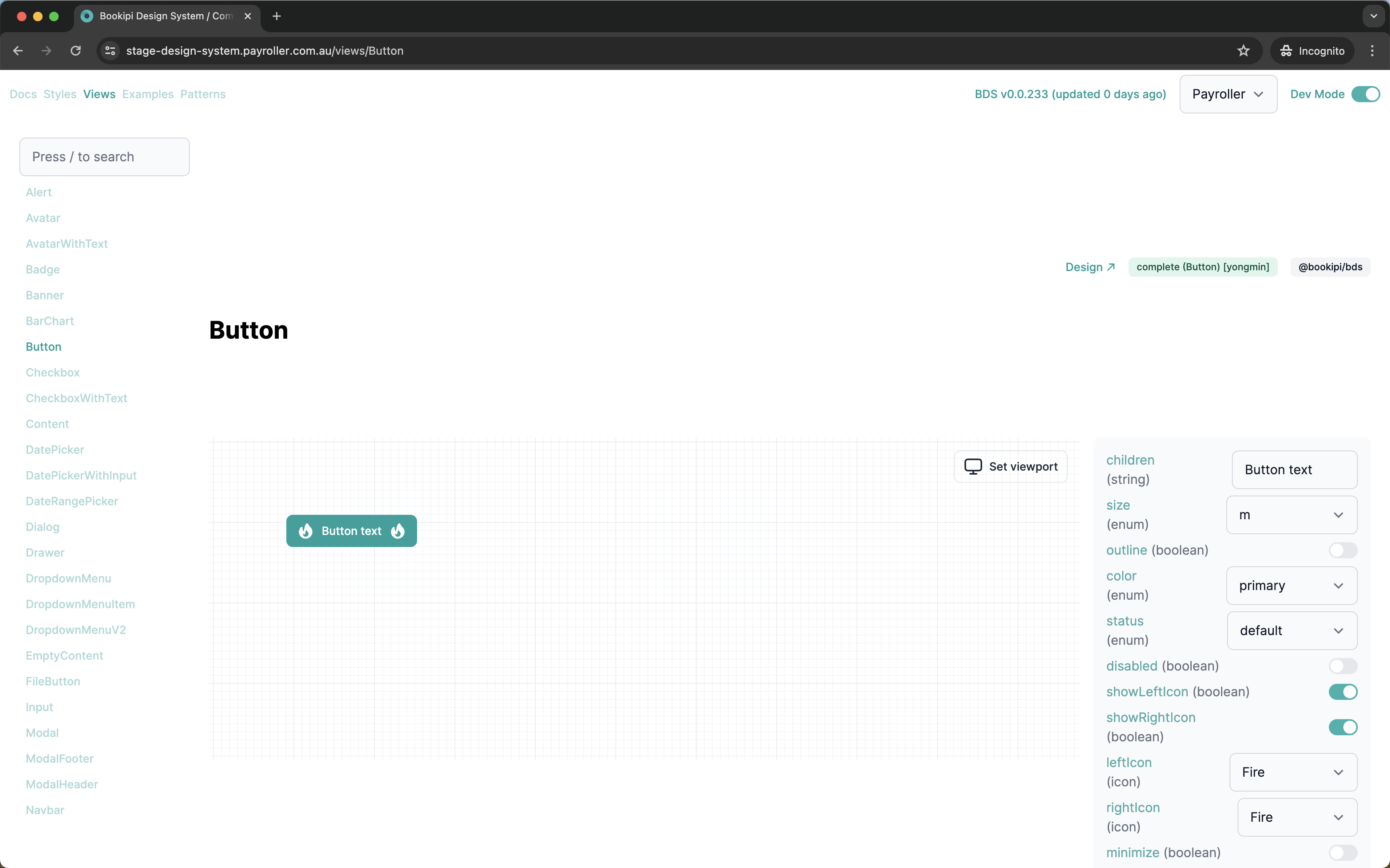
2. Component Properties
Figma’s components have a structure very similar to React components.
So you can expect the same property names and value types for all BDS components.
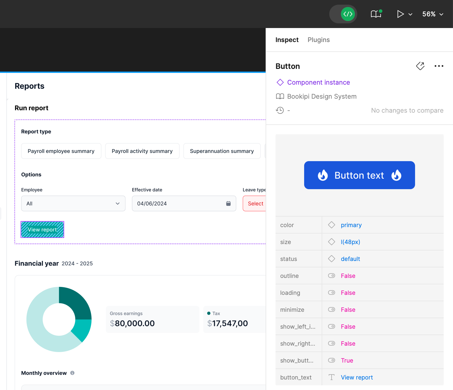
e.g) Button component of BDS in Figma
e.g) Button component of BDS in @bookipi/bds
Workflows: Cases
This section describes how to develop with delivered Figma design files that also include BDS components.
1. Components Are Missing in BDS
- Check the Components page to find the matching component if a Figma layer indicates it is a BDS component (Bookipi Design System).
- If there is no matching component, you can add it to BDS (check Components guide for this).
2. Need to Update BDS
Sometimes designers update existing & developed BDS components (to update designs).
If you find differences between the BDS component in Figma and the developed version, you can update it by following the same guide (Components).
3. It Is Not a BDS Component
Components can be of two types: local components & BDS components.
If it is not a BDS component, you can develop it inside your project and don’t need to link it with @bookipi/bds.
4. It Is Not a Component
Designers only create components in Figma for graphics they frequently use, similar to developers.
If layers are not components, you don’t need to develop them as components. Just use Tailwind CSS with the BDS Styles.